Histograms can lie
Histograms can lie
I bet that nowadays is not a secret for anyone to know that data plots and visualizations can be manipulated (accidentally or not) in such a way that they can lead to incorrect conclusions and misconceptions. This is a very much relevant problem in this data-driven world we live today.
To be fair, this post is just an excuse for leading readers towards this other great post about histograms, which explains virtually everything you need to know about histograms. Here, I'm just exposing another example of data where histograms can lead to wrong conclusions. Just because... why not?
Today I was playing with some histograms for plotting and organizing data for this Small-World Network software I'm working on1. You can check the github repository for more details on the software.
So, the idea is just building this simple network with $L$ nodes and each of them is connected to $Z$ neighbors. The next figure shows such kind of network for $L=40$ and $Z=4$. That is, each node (little dot) connected with 4 of its nearest other dots by an edge (straight line).

One of the ways to characterize a network like this is to compute the minimum distance between a pair of nodes, that is, how may edges one has to pass through to get from one node to the other, that is called the "path length" between those two nodes.
Now, what we want to do is to count the number of path lengths $l$ from each of the nodes to every other node in the afore mentioned network. It shouldn't be hard to notice that there must be an equal amount of path lengths $l$ that satisfy $0 < l < L/Z$, that is, there are as many paths with lengths $1$ as there are with $2$ or $3$ or $4$ or... $L/Z -1 = 9$. To visualize that and check the network is well-built, we can do a histogram and see that in effect the histogram is constant for the range of $1$ to $9$. The next picture shows one of those histograms.

What the... ? This must be wrong!
When one encounters this and one is not that experienced with dealing with histograms it is easy to think that there must be something wrong with the software, maybe it is not counting neighbors properly or whatever (that happened to me to be honest). But the truth is that the histogram is just not well built, it's partitioning the data in a wrong way. That specific histogram was using 7 bins (arbitrarily) and using a dot diagram one can see how it is failing, a parallel between a dot diagram and the histogram can be seen in the figure below

There you can see how dots are just unbalanced for example for the 2nd and 3rd bins, try to count "whole lines" (lines of dots that go from the blue to the "pink" ones in the same bin) and then check the remainder, you can see how that is the cause of the unbalance and confusion. You just have to be careful when choosing bins limits, a good choice for this specific case is having 10 bins as shown in the figure below. And that's basically what the problem is, you have to carefully choose the parameters for your histogram almost exclusively for your case.
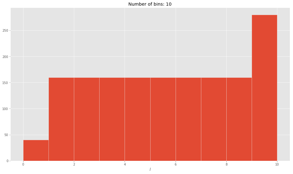
So now we are getting the expected result and we can really draw a correct conclusion from this histogram. As expected, it is constant in the "middle" part, that tells use our network software seems to be giving good results.
In conclusion, when dealing with data visualizations or plots you must choose very carefully what type of plot you will be using and what conditions you need it to meet to give the correct results, for histograms you really need something that lets you play with the number of bins easily, at the bare minimum. Probably for this kind of "purely" discrete data, histograms are not the best way to visualize it, do not marry with a single type of plotting data, always be open to alternatives.